

Make It Clear, Fast, and Trustworthy
Why product pages do more work than most founders think
A lot of small store owners spend time on ads, homepage design, and product photos, then treat the product page like a simple container. Add a title, add a price, drop in a few images, done. The problem is that the product page often does the hardest job on the whole store.
This is where a shopper decides whether the item feels real, useful, and worth the money. It is also where people look for signs of trust, clarity, and ease. If the page feels vague, slow, or incomplete, even interested shoppers can back out fast.
For a small online store, a better product page does not need fancy features. It needs the basics to be easy to find and easy to understand. That is what moves someone from “maybe” to “okay, I’ll try it.”
The product page basics that should be clear right away
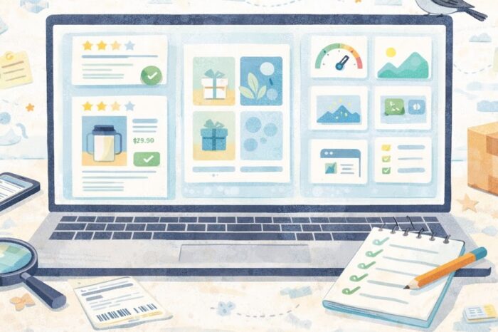
When a shopper lands on a product page, they start scanning for answers. What is this? How much is it? What makes it different? Can I trust this store enough to order? A good page answers those questions without making people hunt.
Start with the product title. Keep it plain and specific. “Linen Table Runner, Sand Beige” is more useful than “The Everyday Favorite.” The second one may sound nice, but it does not help a shopper who opened three tabs and is trying to compare products fast.
The price should be easy to spot. So should any options, like size, color, scent, or bundle choice. If something is sold out, say that clearly. If there is a pre-order delay, say that clearly too. A lot of hesitation comes from pages that hide practical details until too late.
Your product images matter, but not only because they look good. They help reduce uncertainty. A shopper should be able to see the product from enough angles to understand what they are buying. If size matters, include at least one image or note that gives scale. A ceramic mug, a tote bag, and a wall print all benefit from that kind of context.
What should be easy to spot near the top
- Product name
- Price
- Variant options
- Main product image
- Add-to-cart button
- Short summary of what the item is and who it is for
That short summary matters more than some founders expect. It gives the shopper a fast reason to care before they scroll.
How to make a product page feel more trustworthy
Trust is not built by one badge or one line of copy. It comes from the whole page feeling complete. A lot of small online stores lose momentum here because the product looks good, but the page leaves too many unanswered questions.
One of the simplest ways to build trust is to write better product descriptions. A good description should answer real buyer questions. What is it made of? How big is it? Who is it best for? How should it be used, washed, stored, or assembled? A shopper should not need to email support for basic facts.
For example, if you sell a cotton market tote, do not stop at “durable and stylish.” Say the handle drop, the fabric weight if relevant, what fits inside, and whether it can be machine washed. Those details make the page feel more honest.
Reviews can help too, even if you do not have hundreds. A few useful comments can do more than a perfect five-star average with no detail. If customers mention fit, durability, scent strength, or shipping experience, that gives future buyers more confidence.
Shipping and returns should not feel hidden. You do not need a giant wall of policy text on every product page, but shoppers should be able to tell the basics fast. Think in plain language:
- Ships in 2 to 3 business days
- Returns accepted within 30 days
- Final sale on custom items
That kind of copy lowers friction. It makes the purchase feel more predictable.
Another quiet trust builder is consistency. The product title, photos, description, pricing, and checkout button should all feel like they belong on the same page. If the photos look polished but the copy looks rushed, the whole page can feel uneven.
How to keep the page fast and easy to use
A product page can be accurate and still underperform if it feels slow or clunky. This is where speed and usability start to matter.
Big image files are one common issue. Founders want photos to look sharp, which makes sense, but oversized images can slow the page and make mobile browsing frustrating. Compressing images before upload is one of the easiest fixes. It usually has a bigger effect than people expect.
Mobile layout matters just as much. For many stores, a large share of product-page visits happens on phones. Open your own page on a phone and check the basics:
- Can you read the title without zooming?
- Are variant buttons easy to tap?
- Does the add-to-cart button appear without too much scrolling?
- Do photos load smoothly?
- Is the description readable, not a giant text block?
A page can also become hard to use when it tries to do too much. Too many popups, sticky bars, upsells, review widgets, countdown timers, and badge clusters can crowd the screen. For a small store, a cleaner page often performs better because the main action stays obvious.
Practical steps
- Compress product images before uploading them.
- Put the main buying details near the top of the page.
- Break long descriptions into short sections or bullets.
- Test the page on your phone, not just desktop.
- Remove extra widgets that distract from the product.
This kind of cleanup is not flashy, but it helps shoppers stay focused.
A quick product page checklist summary
Quick checklist
- [ ] The product title clearly says what the item is
- [ ] The price is easy to find
- [ ] Variant options are clear and easy to select
- [ ] Images show the product well and help with scale
- [ ] The add-to-cart button is visible without confusion
- [ ] The description answers practical buying questions
- [ ] Shipping or delivery timing is easy to find
- [ ] Returns basics are easy to understand
- [ ] Reviews or proof points help reduce hesitation
- [ ] The page loads cleanly on mobile
- [ ] Images are optimized so the page does not feel heavy
- [ ] Extra widgets do not distract from the main action
If a product page misses several of these basics, it usually feels harder to trust, even when the product itself is strong.
Fix the page that gets the click
A product page does not need to be perfect to work well. It needs to be clear enough that a new shopper can understand the item, trust the store, and take the next step without friction.
That is why product pages are worth revisiting one by one. Start with the pages that already get traffic or feature your best sellers. Tighten the title. Rewrite the description in plain language. Add missing shipping or return details. Compress the images. Check the mobile view. Those small fixes add up.
For a small online store, this is one of the most practical upgrades you can make. A better product page helps with search, helps with ads, helps with word of mouth, and helps the store feel more put together. Sin estrés, that is a strong return for a short list of fixes.
Gentle next step
Pick one product page today, preferably a best seller or a page you already send traffic to. Review it like a first-time shopper, not the owner. If the page leaves basic questions unanswered, fix those first. Clear beats fancy here almost every time.
FAQs
Q1. What is the most important part of a product page?
A1. Clarity is usually the most important part. A shopper should be able to tell what the item is, what it costs, and what to expect without digging through the page.
Q2. How long should a product description be?
A2. Long enough to answer real buying questions, short enough to stay readable. The right length depends on the product, but thin copy usually hurts more than slightly longer copy.
Q3. Should shipping and returns appear on the product page?
A3. Yes, at least the basics. Shoppers often look for shipping timing and return expectations before they add something to cart.
Q4. Do product pages matter even if most traffic comes from ads or social media?
A4. Yes. The product page is often where that traffic lands, so it carries a lot of the trust and conversion work.
![]()
Trending Now
Make It Clear, Fast, and Trustworthy