
Category Page Checklist for Ecommerce
Why category pages matter more than they seem
A lot of small store owners put most of their attention on the homepage and product pages. That makes sense, but it can leave a weak middle step in the shopping path. Many visitors are not ready to buy one exact item right away. They want to browse first, compare a few options, and get a feel for what the store offers.
That is where category pages do important work. A good category page helps shoppers move from general interest to a more focused choice. It also helps the store feel easier to use. When browsing feels smooth, people stay longer, look at more products, and feel less friction.
For a small online store, a better category page does not need fancy filtering systems or a huge catalog. It needs clear organization, easy scanning, and enough context that a new visitor knows where they are and what to do next.
What a good category page should do first
A category page should quickly answer one basic question: what kind of products are on this page? If that answer feels fuzzy, browsing gets harder right away.
Start with a category title that is plain and specific. “Handmade Soap Bars” is more useful than “Clean Living Essentials.” The second phrase may sound nice, but it makes the shopper do extra thinking. Clear naming helps people browse faster.
A short intro can help too, especially if the category might need context. You do not need a long paragraph. A couple of lines is enough to explain what the shopper will find, who the products are for, or what makes the category useful.
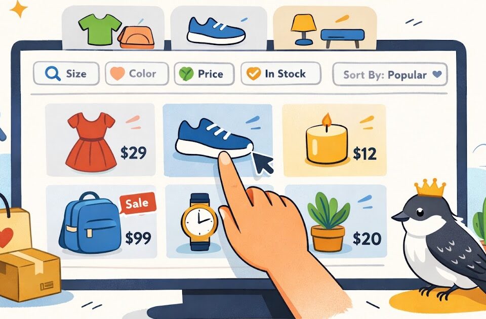
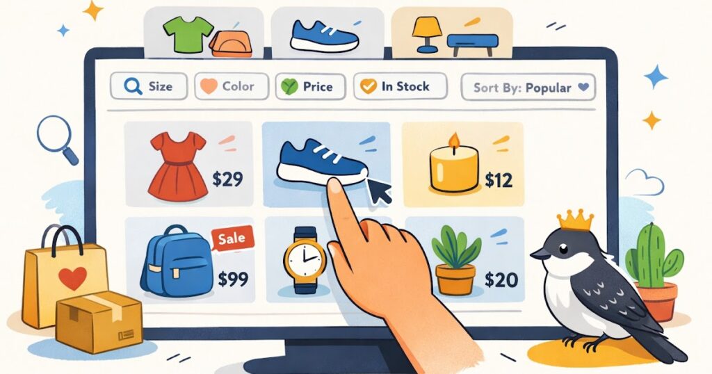
The product grid itself should feel clean and scannable. That means consistent product images, readable product names, visible prices, and enough spacing that the page does not feel crowded. If every thumbnail is cropped differently or every title is a different length and style, the page starts to feel messy.
What should be easy to spot near the top
- Clear category title
- Short category description when helpful
- Product count or visible product grid
- Useful sort or filter options
- A layout that feels easy to scan on desktop and mobile
This is not about making the page look busy. It is about giving shoppers a quick sense of direction.
How to make browsing easier without overcomplicating the page
The best category pages reduce small moments of confusion. They help shoppers narrow choices without turning the page into a control panel.
Filters can help a lot, but only when they are useful. If you sell apparel, filters like size, color, fit, or material may help. If you sell candles, filters like scent family, size, or gift set might make more sense. Do not add filters just because the theme allows them. Add the ones that help real browsing decisions.
Sorting matters too. Many shoppers expect basic sort options like newest, price, or best sellers. Keep the list simple. Too many sort choices can become noise.
A common issue on small stores is category pages that show products but hide too much detail. A shopper often needs at least a little information before clicking. A clear product name and visible price are the basics. Depending on the store, a short product subtitle, a review cue, or a quick badge like “Best Seller” can also help.
Practical steps
- Use category names that sound obvious to a first-time shopper.
- Keep the product grid visually consistent.
- Show the product name and price clearly under each item.
- Add filters only when they help actual decisions.
- Test the page on mobile to make sure browsing still feels easy.
Another thing to watch is pagination or lazy loading. However your store handles more products, make sure the experience stays smooth. A shopper should not feel like the page is fighting them.
What makes a category page feel more trustworthy
A category page may not seem like a trust page, but it absolutely affects trust. When browsing feels sloppy or confusing, people start to wonder what the rest of the store will be like.
One trust builder is consistency. Product cards should feel like they belong together. Image sizes should match. Titles should follow a similar format. Prices should be easy to find. If some products show basic info and others show almost nothing, the page feels uneven.
Another trust builder is clarity around stock, pricing, and expectations. If something is sold out, show that clearly. If an item has multiple options that affect the price, make that easy to understand before the shopper clicks too far. Surprises create friction.
Category pages can also feel more trustworthy when they connect well to the rest of the site. For example, a shopper browsing kitchen storage might want a quick path to shipping info, returns basics, or a related guide. Internal links, breadcrumbs, and logical navigation help the page feel more complete.
This does not mean you should crowd the page with policy text. It just means the store should feel connected and easy to explore.
A simple example: imagine a small gift shop with a “Desk Accessories” category. If the page has clear product thumbnails, visible prices, a helpful sort option, and a smooth path into product pages, it feels calm. If the same page has uneven images, vague product titles, missing prices, and confusing filters, the shopper may bounce before they ever see your best item.
A quick category page checklist summary
Quick checklist
- [ ] The category title clearly says what the page contains
- [ ] A short intro gives context when needed
- [ ] Product images look consistent
- [ ] Product names are readable and specific
- [ ] Prices are visible in the grid
- [ ] Filters help real shopping decisions
- [ ] Sort options are simple and useful
- [ ] The page is easy to browse on mobile
- [ ] Sold-out items are labeled clearly
- [ ] Navigation, breadcrumbs, and links feel logical
- [ ] The page looks organized, not crowded
If several of these basics are missing, browsing will usually feel harder than it should.
Fix the pages people browse before they buy
A lot of sales start with browsing, not buying. That is why category pages deserve more attention than they usually get. They help shoppers narrow choices, understand what the store offers, and move toward a product page with more confidence.
For a small online store, improving category pages is often a practical win. You do not need a huge redesign. Start with clearer category names, cleaner product cards, and filters that actually help. Then check the page on your phone and see if it still feels easy to use.
These are not flashy changes, but they matter. A category page that feels clear and organized can quietly improve the whole shopping experience.
Gentle next step
Pick one category page this week, preferably one with steady traffic or a lot of products. Review it like a first-time shopper. If the page feels cluttered, vague, or hard to scan, fix the basics first: title, product grid, prices, filters, and mobile layout. Sin estrés. Small browsing improvements can make the whole store feel easier to trust.
FAQs
Q1. What is the main job of a category page?
A1. Its main job is to help shoppers browse a group of related products without confusion. A good category page makes scanning, comparing, and narrowing choices easier.
Q2. Should every category page have filters?
A2. Not always. Filters help when they support real shopping decisions. On a small store with a limited catalog, too many filters can make the page feel more complicated than helpful.
Q3. How much text should go on a category page?
A3. Usually not much. A clear title and a short helpful intro are often enough. The page should stay easy to scan, not turn into a wall of text.
Q4. Why do category pages matter if product pages do the final selling?
A4. Because many shoppers browse before they commit. If the category page feels messy or unclear, some people will leave before they ever reach a product page.